MY ANALYSIS
What's Going On Here?
Overall, this is a high-level view of some quantitative analyses of the text that makes up our media sphere. I've called attention to some of the things I found most interesting below. To see the actual code behind these analyses (and get a view of what libraries and methods I used), download my notebook with the button below.

TRUMP ON TWITTER
As we can see, Trump's tweets have been heating up over time, with more extremely positive and extremely negative tweets, though the majority are still interpreted as rather non-polar by R. We see a shift in engagement away from the center and towards the fringes too in the past couple years, as is denoted by the coloring and dot size shift, which represent engagement in retweets and favorites respectively.

TRUMP'S INCREASING POLARITY
The absolute value of the emotional charge of Trump's online rhetoric has been increasing. This is present in the prior plot, and visualized with a trend line here.

DOES POLARITY DRIVE ENGAGEMENT?
As we can see from the output of the model, there's a significant correlation between engagement with Trump's tweets (as measured by sqrt(retweets * favorites)) and a number of other factors. The factors I measured were as follows: was his tweet a retweet; is he calling someone out ('@ing' them); is he replying to someone ('beef'); the absolute value of emotion of the tweet ('magsenfinn'); and of course the date. His later tweets get more engagement, presumably thanks to more followers, and the emotional charge of his tweets also correlates with their popularity. The rest of the factors track with less engagement.
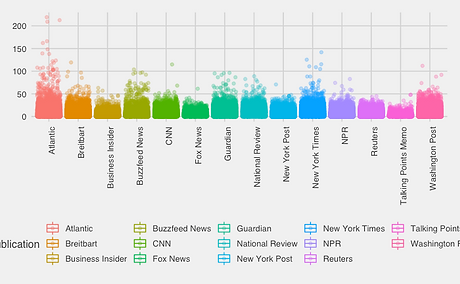
IS THE NEWS POLARIZED?
This chart displays the absolute value of the net polarity for each article from each publisher in the dataset. Surprisingly, none were particularly skewed towards stronger emotions. The average net polarity of articles from each publisher were also very comparable.

WHO IS CLICKBAITING?
Based on this analysis of article title extremity, we can empirically show that Breitbart, Buzzfeed, The Guardian, and Fox tend to have the most inflammatory article titles.

COMPARING TRUMP & THE MEDIA
When compared, there was not a substantial relationship between the daily avg. sentiment of Trump's tweets and that of the news for the given day. This comparison yielded a model with an R square of only .007, though there was a statistically significant relationship between the two. And while Trump's polarity has been increasing, that of the media has been consistent over the trial period.
ADDITIONAL INSIGHTS
I've also taken this data and uploaded it to Tableau Public via the workbook linked below (and above, since the embed evidently doesn't work in some browsers/Wix Sites). For more visualizations and insights like the ones above, click through the sheets in the window below and read the captions at the bottom of each of them.

CONCLUSIONS
Based on the analyses above, we see that Trump, at the very least, has been becoming increasingly polarized over time. We also see very different patterns among the major publishers, in regards to who, how much, and what kinds of content are in their pipelines. The validity of the results beyond this, though not weak, definitely could be improved in some areas before they're considered robust. (Full explanation of potential validity problems with this project are below.) But in short, though the media is more overwhelmingly negative in its sentiment, it seems to be less extreme/polarized than Twitter, and certainly than Trump's tweets.
POTENTIAL ISSUE AREAS:
Though much of the analysis described above is substantial, there are definitely areas for improvement and for further research. An overview of those is as follows:
More robust media data; Google News doesn't have an R API, so I had to use a dataset from Kaggle that only had about 2 years' worth of articles in it, and even then I didn't have any way of discerning what was included in the set and why.
More robust Twitter data; the twitteR library for R is good, but it limits your pulls. My analysis would be much more substantial if I could pull a volume of randomized tweets as opposed to just the most recent ones.
Polarity analysis; while there is a qdap package that does explicitly analyze text polarity, the rJava package required to run it would not open on my computer no matter how hard I tried, so I had to settle with extremity of sentiment as a proxy for polarity. There are probably other packages that could do more robust text analysis as well.